



If you have ever clicked Insert, chosen a chart, and still ended up with something confusing, the issue usually started before the chart was inserted. Messy source data, the wrong chart type, or unhelpful labels can turn a simple quarterly sales report into a visual that slows people down instead of helping them decide.
In this guide, I'll walk you through how to create charts in Excel in a way that is repeatable, practical, and polished enough for business reports, class projects, dashboards, and financial analysis.
1. Preparing Your Data & Choosing the Right Chart
This section covers the groundwork that makes every chart easier to build, read, and maintain. Before you insert anything, take a minute to structure the data and match the visual to the question you actually need to answer.
1.1 Start with clean, chart-ready data
Before you build anything, put your data into a simple table where each column has one job. For example, a budget worksheet should use headers such as Month, Department Spend, Revenue, and Profit Margin rather than mixing labels, totals, and notes inside the same range. Excel uses headers for legends and axis labels, so clear names save cleanup time later.
- Remove blank rows and blank columns so Excel does not guess the wrong range.
- Confirm that numbers are stored as numbers, dates as real dates, and categories as text labels.
- Use Data > Remove Duplicates if exported reports contain repeated records.
- Use
=TRIM(A2)to clean extra spaces in names or departments, then use Find and Replace for recurring fixes like replacing “N/A” with blanks or standardizing abbreviations.
In a real office setting, this matters immediately. If your quarterly sales report lists Q1 as text in one row, a date in another row, and a merged cell in the header area, your chart will be harder to sort, scale, and explain. In practice, clean structure is what drives chart quality and keeps later formatting decisions simple.
1.2 Match chart type to the question you want to answer
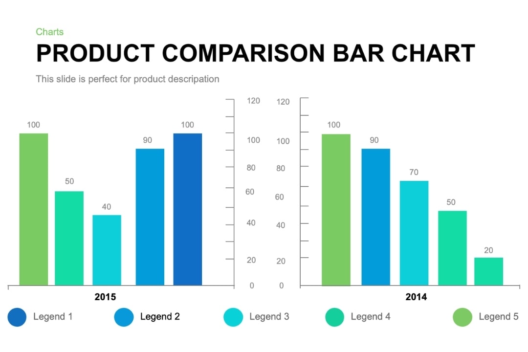
The fastest way to choose the right visual is to ask what question the reader needs answered. If you are showing change over time, use a line chart. If you are comparing categories, use a bar or column chart. If you are showing a part of a whole, use pie or donut charts sparingly and only when the category count stays small. If you are comparing two variables like ad spend and leads, use a scatter plot.
| Business question | Best chart | Example |
|---|---|---|
| What changed over time? | Line chart | Monthly revenue trends for a regional office |
| Which category is highest or lowest? | Bar or column chart | Quarterly sales by region |
| How is a total divided? | Pie or donut chart | Budget allocation by department with 5 categories |
| Do two measures move together? | Scatter plot | Website traffic vs. conversions |
| How does magnitude build over time? | Area chart | Total active users by month |
This decision framework is more useful than memorizing chart names because it keeps your focus on the message. In practice, that means a budget-vs.-actual comparison usually belongs in clustered columns, while a monthly revenue trend belongs in a line chart even if a pie chart looks more decorative.
1.3 Add a caution on date/time data
Date-based charts fail when Excel cannot tell whether your horizontal axis should be treated as time or text. A Date Axis spaces points proportionally, while a Text Axis treats every label as evenly spaced text. That difference matters when you chart monthly revenue, payroll periods, or irregular timestamps.
- Check that your source column contains true dates, not text that only looks like dates.
- Open the axis formatting pane and confirm Excel is using a date-aware scale when you expect time spacing.
- If you are charting time-of-day or irregular intervals, consider XY-Scatter with lines and markers instead of a standard line chart.
That last point is especially important for analysts who track hourly call volume, production logs, or service response times. When spacing accuracy matters, XY-Scatter is often the more reliable choice for time-based data.
1.4 Evidence notes from research
The consistent pattern is clear: clean data structure, appropriate formatting, and intentional chart selection produce the most readable charts.
2. Creating Your Chart — Insert, Recommended & Source Data
With the data prepared, the next step is turning it into a chart that starts strong and stays easy to fix. This section walks through range selection, chart insertion, recommendations, and source-data adjustments.
2.1 Select the right data range first
When people ask how to make a graph in Excel, the most useful answer starts with range selection. Select the values you want to chart along with the headers that describe them. For a monthly sales chart, that usually means selecting Month and Sales together, not the entire worksheet.
- Highlight the main data block including headers.
- If your labels and values are separated, you can hold Ctrl and select non-contiguous ranges, but expect mixed results in some workbook layouts.
- If non-contiguous selection creates a confusing preview, copy the data into one clean contiguous table first. That is usually the more reliable option.
- If you expect frequent updates, convert the range to a Table with Ctrl+T before charting so added rows are more likely to flow into the chart automatically.
Charts typically update when new values are added inside the original selected range, but they do not always expand when new rows fall outside it. That is why source selection is not just a setup step; it determines whether your chart remains useful after next month’s numbers arrive.
2.2 Insert a chart using Excel’s standard workflow
Once your range is ready, the standard chart workflow is straightforward and fast enough for most reports.
- Select the source data.
- Go to the Insert tab.
- Choose a chart directly from the chart group, or open the full gallery to see more options.
- Insert the chart into the current worksheet and immediately check whether the labels and series make sense.
- Use Alt+F1 to create a quick embedded chart from selected data or F11 to place a chart on its own sheet when you want a fast first draft.
This is the core workflow behind how to make a chart in Excel, but do not assume the first result is final. Skilled Excel users often create a quick draft first, then refine the structure, axis, and formatting afterward.
2.3 Use Recommended Charts intelligently
Recommended Charts is helpful when you want a smart starting point without manually testing every chart type. Excel reads your data structure and proposes likely matches, but you still need to judge whether the preview actually supports your message.
- Select the data range.
- Go to Insert > Recommended Charts.
- Click through the previews and read them like your audience would: Is the comparison obvious? Are the labels crowded? Does the chart answer the real question?
- Override the suggestion if Excel emphasizes the wrong story, such as ranking categories when you actually need a time trend.
- Use the All Charts tab when the recommendations are close but not quite right.
This preview-and-override approach is one of the easiest ways to improve chart quality without adding complexity.
2.4 Edit chart source data after insertion
If the chart lands in the workbook but tells the wrong story, fix the source rather than starting over. Excel gives you several ways to reassign what appears as a series, what becomes the horizontal axis, and where the data comes from.
- Right-click the chart and choose Select Data.
- Use Switch Row/Column if Excel plotted months as separate series when you wanted months on the horizontal axis.
- Use the series list and arrow controls to reorder series so the most important measure appears first.
- Edit the horizontal axis labels if the wrong range is attached.
- If the source data lives on another worksheet, use Select Data to point the series and label ranges to that sheet directly.
- When Excel shows colored source outlines on the sheet, you can often drag the highlighted borders to redefine the range quickly. If drag handles are not available in your version, return to Select Data and update the references manually.
This matters in real workbooks. A budget-vs.-actual chart may initially plot each department as a separate series, but management may need months across the bottom and only two series: Budget and Actual. Source-data editing is often what transforms a technically correct chart into a decision-ready one.
2.5 Evidence notes from research
A strong workflow usually combines a sensible first draft with source-data cleanup through Select Data and Switch Row/Column when the initial chart is not telling the right story.
3. How to Create Common Chart Types — Line Graphs & Bar Graphs (Step-by-Step)
Most Excel users rely on a few chart types again and again, so it helps to know the simplest process for each one. This section focuses on the two formats people use most often for trends and comparisons.
3.1 Step-by-step: create a line chart in Excel
If you need to show direction over time, this is the most common answer to how to create a line graph in Excel. Use it for monthly revenue trends, expenses, website traffic, or student scores across reporting periods.
- Arrange dates or time periods in the first column and values in the next column.
- Select the full range including headers.
- Go to Insert.
- Choose Line or Line with Markers.
- Add a clear title such as “Monthly Revenue Trend — 2026.”
- Add axis titles if the units are not obvious, especially for dollars, percentages, or headcount.
- Check whether the horizontal axis displays dates in the expected order and spacing.
For example, if a US regional office wants to review monthly revenue trends before a board meeting, a line chart shows the movement clearly and makes spikes, dips, and seasonality easy to spot. If the chart looks wrong, first check whether the dates are true Excel dates. If the gaps between points still look misleading because the intervals are irregular, switch to XY-Scatter with lines and markers.
3.2 Step-by-step: create a bar or column chart in Excel
When the goal is side-by-side comparison, this is the answer to how to create a bar graph in Excel. It works well for comparing departments, regions, products, expense categories, or sales reps.
- Place category names in one column and values in the next.
- Select the data with headers.
- Go to Insert.
- Choose Bar for horizontal bars or Column for vertical bars.
- Use horizontal bars when category names are long, such as department names or product descriptions.
- Sort the underlying data if you want the ranking to be obvious from highest to lowest.
- Add data labels if exact values matter, such as in a quarterly sales by region report.
A quarterly sales dashboard is a perfect example. If you want to compare Northeast, South, Midwest, and West side by side, a column chart works well. If the categories are longer, such as “Consumer Electronics” and “Professional Services,” a horizontal bar chart is usually easier to scan.
3.3 Help readers choose between line and bar quickly
Use a line chart when time is the story and a bar or column chart when categories are the story. That rule prevents one of the most common Excel mistakes: using a chart that is technically valid but visually unhelpful. If you are asking “What happened month to month?” choose line. If you are asking “Which region performed best?” choose bar or column.
3.4 Optional callout box ideas within the article
3.5 Evidence notes from research
For most everyday reporting, line charts are the clearest choice for trends over time, while bar and column charts are the clearest choice for direct category comparisons.
4. Customizing Chart Appearance — Titles, Labels, Axes & Style
Once the chart type is right, the biggest gains come from simple formatting choices. This section focuses on the adjustments that make charts easier to read without making them look busy or overdesigned.
4.1 Add the essential chart elements
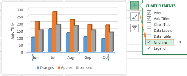
A basic inserted chart is rarely presentation-ready. Start by adding only the elements that make interpretation faster.
- Click the chart, then use the Chart Design tab or the + Chart Elements button.
- Add Chart Title and write a title that states the point, not just the data source.
- Add Axis Titles if the unit is unclear.
- Add Data Labels when exact values matter more than pattern recognition.
- Move or simplify the Legend so it supports the chart without stealing attention.
For a budget-vs.-actual comparison, the best setup is often a short descriptive title, a dollar-based Y-axis title, and direct labels on the bars so the audience does not need to bounce between bars and legend. Use Ctrl+1 to open formatting options for the selected chart element faster.
4.2 Refine axes and scale for readability
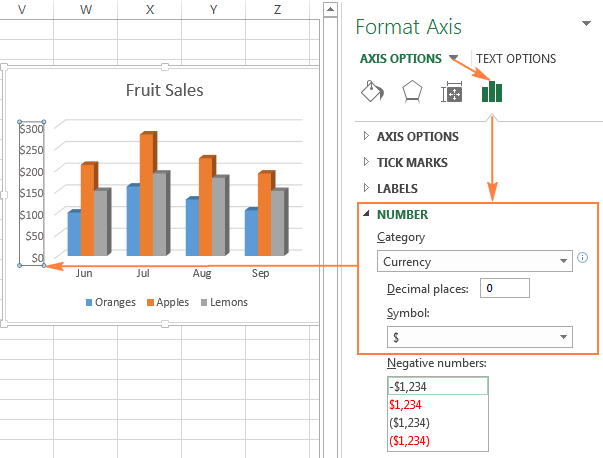
Axis settings control how honest and readable your chart feels. Financial charts in particular need sensible scales and number formats so the audience can understand values without mental math.
- Click the Y-axis and open Format Axis.
- Adjust the minimum and maximum bounds when the default range hides meaningful variation or exaggerates it.
- Change the major units so labels appear at useful intervals, such as every $10,000 or every 5%.
- Apply number formats such as currency, percentage, decimals, or whole numbers to match the business context.
- For bar charts, sort the source data if ranking matters more than original data entry order.
Example: if you chart monthly revenue in dollars, format the axis as currency and use intervals that fit the data size. A $0 to $500,000 scale with $100,000 jumps may work for a corporate report, while a student project might need tighter intervals to show variation clearly.
4.3 Improve visual style without overdesigning
Professional chart styling is mostly about restraint. Use business-friendly colors, consistent fonts, and enough contrast to guide the eye without adding clutter.
- Use Chart Design to test layouts and color palettes.
- Keep one consistent accent color for key series across recurring reports.
- Reduce unnecessary gridlines and keep only the ones that help estimate values.
- Adjust font sizes so titles and labels remain readable when pasted into PowerPoint or PDF reports.
- Right-click a polished chart and choose Save as Template to create a reusable .crtx file for future dashboards or monthly reporting packs.
This is especially useful in finance teams that publish the same quarterly sales and budget reviews every month. A reusable chart template helps preserve consistency across presentations or shared workbooks.
4.4 Explain common cleanup decisions
Clean up the chart the same way you would clean up a slide: remove anything that does not help the reader. Shorten overlong titles, use direct labels when a legend adds friction, and avoid colors that imply meaning you do not intend. Red and green, for example, can suggest good and bad even when you only meant category distinction.
If you need to call out an unusual spike, add a shape or text box rather than crowding the title with commentary. A short annotation such as “Promotional campaign launched” can explain a sudden jump in website traffic or revenue without forcing the audience to guess.
4.5 Evidence notes from research
Clear titles, readable labels, sensible axis settings, and restrained styling do more for chart quality than decorative effects or extra elements.
5. Leveling Up — PivotCharts, Combo Charts, Secondary Axes & Dynamic Charts
After the basics feel comfortable, a few advanced options can make recurring reports much more flexible. This section introduces the upgrades that help when datasets get larger or the story involves multiple measures at once.
5.1 PivotCharts for large or filterable datasets
PivotCharts are the best next step when a normal chart becomes hard to maintain. They are ideal for large sales tables, transaction-level exports, or workbooks that need filtering by month, region, salesperson, or category.
- Start with a clean table that has consistent headers and no blank rows.
- Go to Insert > PivotChart.
- Confirm the table or range and choose where the chart should appear.
- Drag fields into Values, Axis, and Series.
- Group date fields into months, quarters, or years when needed.
- Add a Timeline Slicer if users need quick date filtering.
A practical example is a sales workbook with every transaction for the year. Instead of manually rebuilding a chart each month, you can create a PivotChart that shows sales totals by month and salesperson, then filter it instantly for a specific quarter or region.
5.2 Combo charts and secondary axes
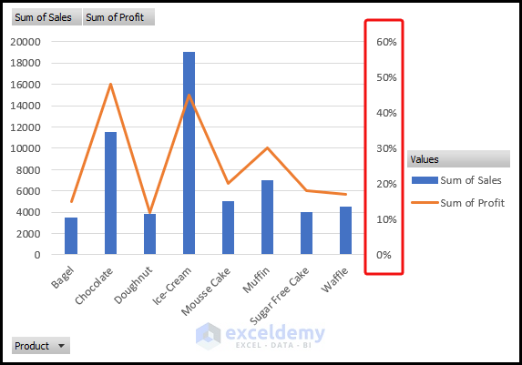
Combo charts solve a common reporting problem: two useful metrics with very different scales. Think revenue and profit margin, traffic and conversions, or units sold and defect rate.
- Create the initial chart from your source data.
- Change the chart type to Combo.
- Assign one series to columns or bars and the other to a line if that makes the story easier to read.
- Turn on a Secondary Axis for the series with the very different scale, such as a percentage line over dollar-based bars.
- Label both axes clearly so the audience knows exactly what each scale represents.
Use secondary axes carefully. They are powerful, but they can also make weak relationships look stronger than they are. If the chart feels harder to explain after you add the second axis, simplify it or separate the metrics into two charts.
5.3 Dynamic charts: what to include carefully
When you need a chart to keep up with changing data, the safest advice is practical and modest. Excel charts often update when new values are added within the existing selected range, and PivotCharts provide the clearest dynamic option. Beyond that, Excel Tables are a strong best practice for keeping ordinary charts easier to expand.
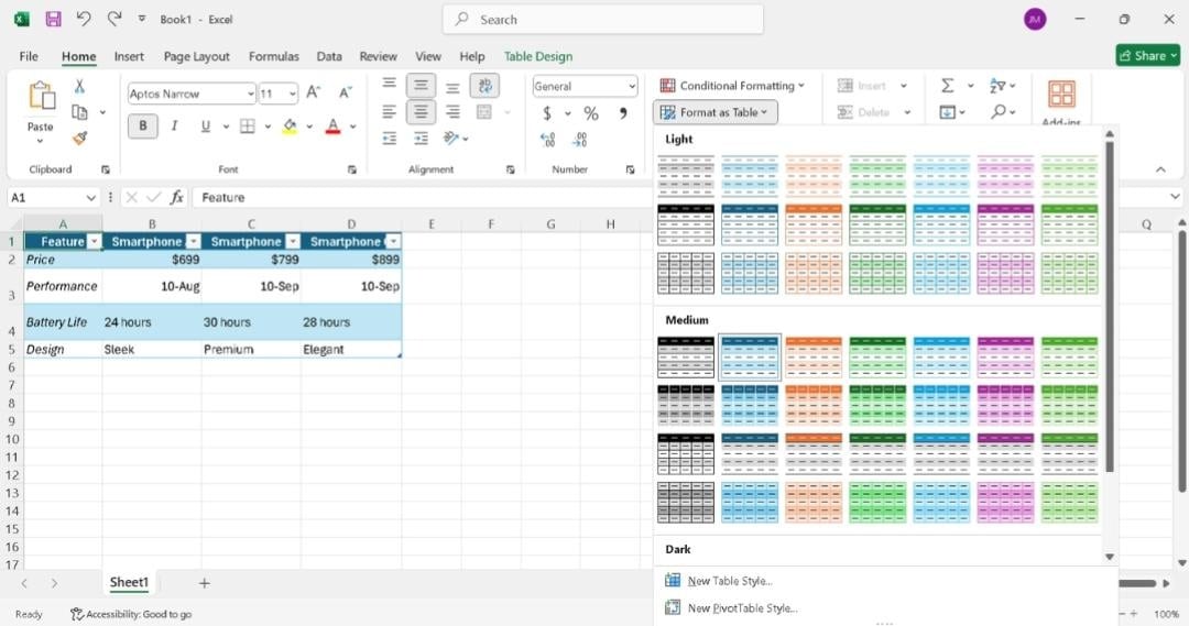
- Convert the source range to a Table with Ctrl+T.
- Create your chart from the Table rather than from a fixed cell range.
- Add new monthly rows beneath the Table and confirm the chart expands as expected in your workbook.
- If the chart does not expand cleanly, update the range through Select Data or use a named range strategy managed by an experienced Excel user.
Named ranges can support advanced auto-updating charts, but they are usually most helpful when you already have a template-driven reporting process. For many office users, a Table-based chart or PivotChart delivers the best balance of flexibility and simplicity.
5.4 Evidence notes from research
As charts become more advanced, the most reliable improvements usually come from filtering, combining chart types thoughtfully, and using source ranges that are easier to maintain over time.
Conclusion
This final section brings the full workflow together so the main ideas are easy to remember. The goal is not to use every Excel feature, but to follow a process that keeps charts clear, accurate, and useful.
Creating strong Excel charts is less about memorizing every chart type and more about following a reliable workflow: clean the data, choose the chart based on the question, insert a smart first draft, and then customize only the elements that improve clarity. That approach works whether you are building a budget-vs.-actual comparison, a quarterly sales report, or a monthly revenue trend chart.
If you want to get better quickly, start with one of your own spreadsheets today. Build a line chart for a trend, a bar chart for a comparison, and then test Recommended Charts, Select Data, and axis formatting on the same workbook. The more you treat chart creation as a repeatable process, the faster you will move from raw numbers to polished, decision-ready visuals.
FAQ
These quick answers cover a few common questions that come up after people begin building charts in real workbooks. Use them as a fast reference when the basics are in place but a specific issue needs a clear fix.
FAQ 1. What is the best chart type to use in Excel for trends over time?
Usually a line chart. If your data uses irregular date or time intervals, XY-Scatter may be more accurate because it handles spacing more reliably than a standard line chart.
FAQ 2. Why is Excel not charting my dates correctly?
Your dates may be stored as text instead of true date values, or the axis may be acting like a text axis instead of a date axis. For time-of-day data, try XY-Scatter with lines and markers.
FAQ 3. How do I change the data range or fix the labels on an existing Excel chart?
Right-click the chart and choose Select Data. From there, you can edit series ranges, switch row and column orientation, change axis labels, and reconnect the chart to data on another worksheet.
FAQ 4. When should I use a secondary axis in Excel?
Use a secondary axis when two series have very different scales, such as revenue and profit margin. Label it clearly and use it carefully so the chart does not become misleading.
FAQ 5. Can I save a chart style in Excel and reuse it later?
Yes. Right-click a finished chart and choose Save as Template to create a .crtx file. You can apply that template later from the chart templates area when building recurring reports.